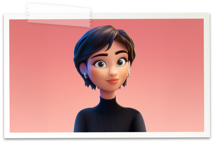

Hi there! I’m Dora, and I’m the Art Director at Storigami.
I’ve been part of the team since the very beginning, back when this was still just Carey’s dream on a notebook. My role has been to shape everything visual about the product: the app, the brand, the characters, the way it all feels and looks. Basically, if you can see it, I’ve probably worked on it.
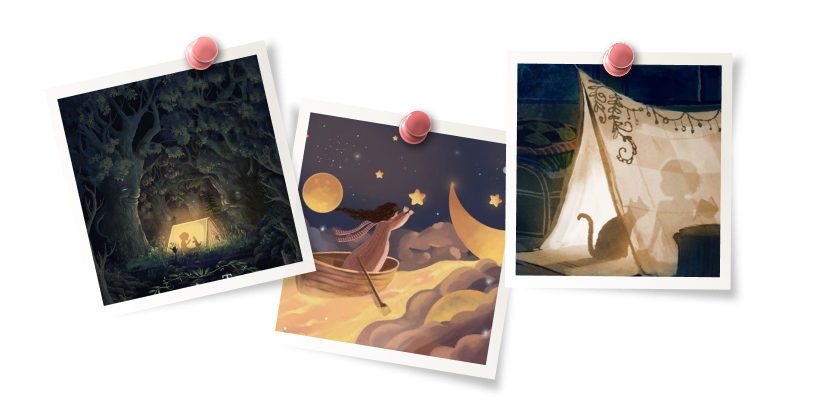
The first thing I created wasn’t a logo or a character, but wireframes. We spent months defining what the app needed to do before deciding what it should look like. Once we began exploring visual directions, the concept that stood out, and the one we ultimately chose, was built around a dreamy, whimsical, and imaginative atmosphere. The kind of space a child might picture while tucked into a pillow fort with a flashlight and a book. That became the foundation of Storigami’s visual world.
The Look and Feel
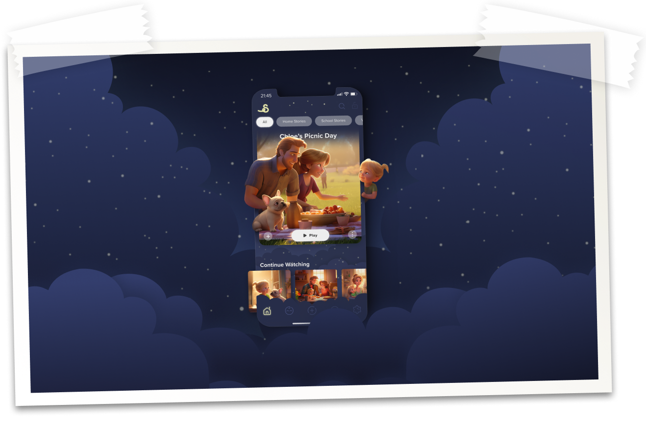
We drew inspiration from the sky: navy blue night skies, glowing stars, and a feeling of warmth and wonder. One reason for that choice is that Storigami is meant to be deeply personal, welcoming, and relatable to all kids, no matter their background or identity. The sky gave us that foundation. It’s universal. We all share it.
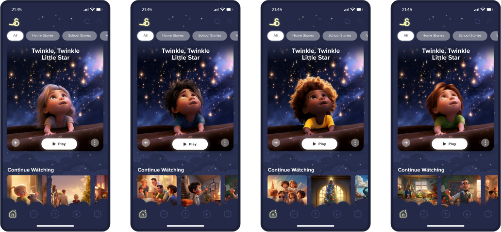
Visually, we kept pushing that feeling throughout the app. One of my favorite touches is the glowy effect we use to represent stars or sunlight. It shows up on the logo, buttons, icons, and titles. Small detail, but it does a lot of work in keeping everything connected and cohesive.
A Home for Families
When it came to the app’s structure, we didn’t want to reinvent the wheel. Storigami is meant to be part of everyday family life, so it needed to feel intuitive and familiar from the start. We followed design patterns people already know from streaming services, things like how episodes are displayed, how navigation works, and how content is organized. That way, both kids and parents can pick it up right away without friction.
At the same time, we layered Storigami’s unique identity on top of that familiar foundation. The whimsical visuals, the glowing details, and the immersive storytelling give the app its own personality, but the framework beneath it all is tried and true. This balance is what makes the experience both seamless and special, easy to adopt, but unlike anything else once you’re inside.
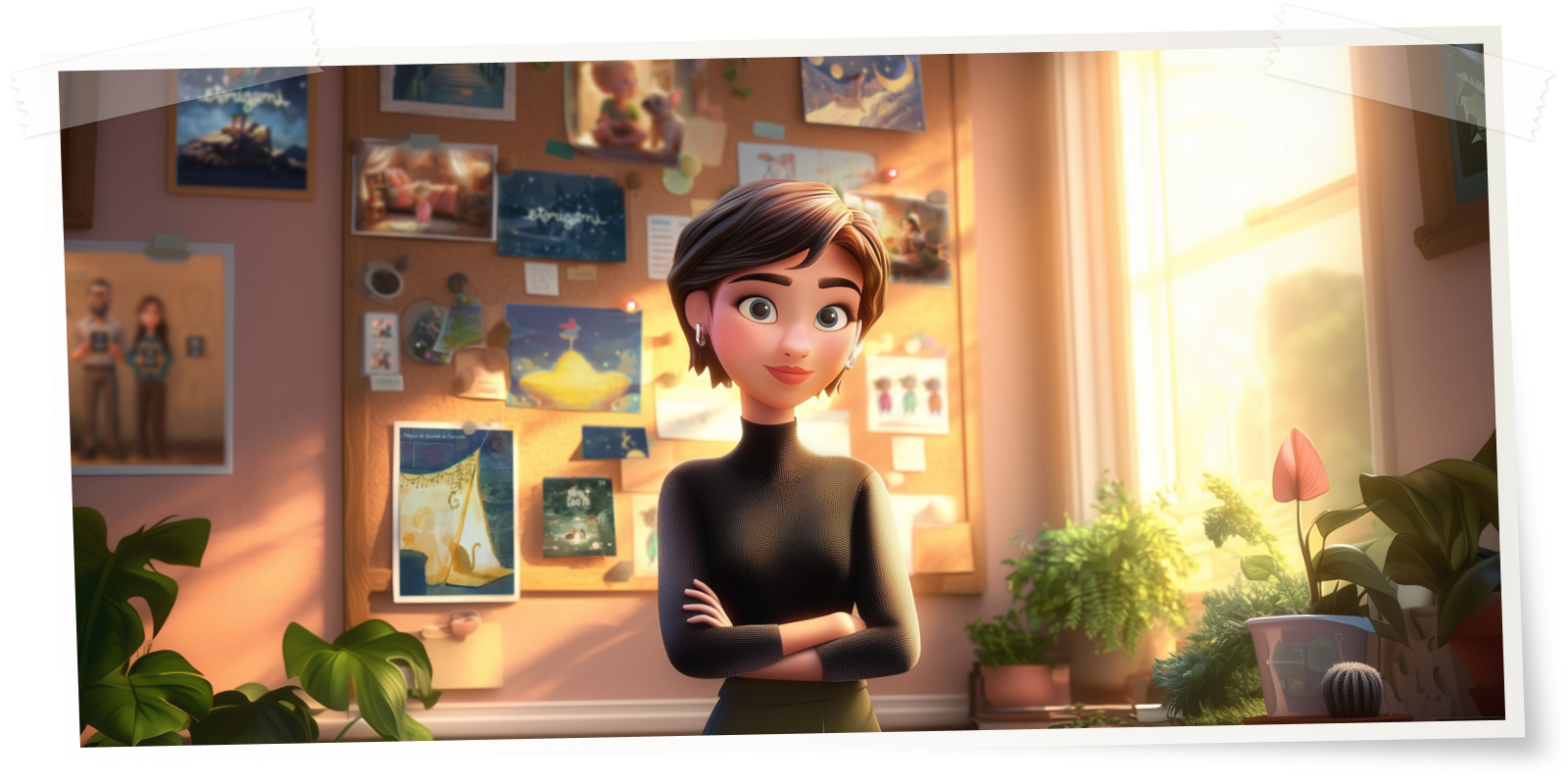
One of my proudest moments was when I designed the first draft of the app’s home screen. After months of low-fidelity sketches, the visual direction just flowed. It was one of those rare moments in design where your instincts align perfectly with the product. The vision, the mood, the experience, it all clicked. This is it, I thought. This is Storigami.
Trials, Errors, and a Little AI Magic
Of course, not everything was that smooth. In the early days, using AI to generate character visuals was a challenge. Tools like MidJourney weren’t as powerful or consistent back then, so every image involved hours of fine-tuning prompts, followed by even more time in Photoshop. It was equal parts tech and craftsmanship. Today, with better tools, the process is faster, but the spirit of hands-on design hasn’t changed. We still obsess over the details.

When It Becomes Real
We haven’t launched yet, so I haven’t seen real kids using the app. But I’m incredibly excited for that moment. I’ve put a lot into this project: time, energy, care, and I can’t wait to see how families experience it. My hope is that one day, Storigami won’t feel like a new idea at all.